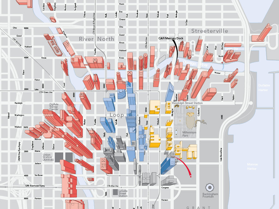
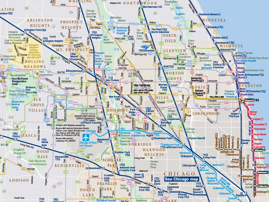
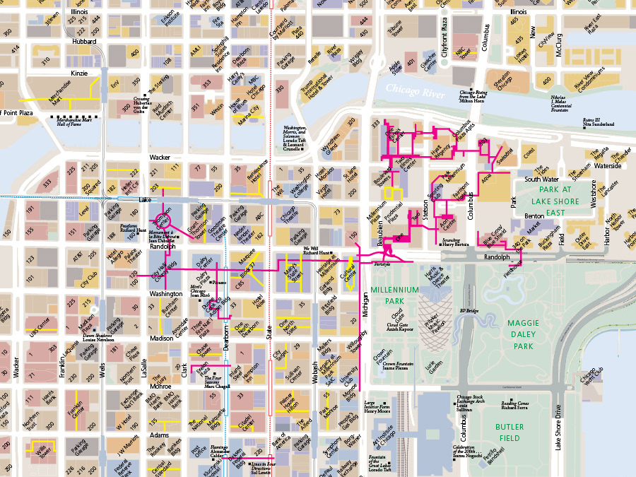
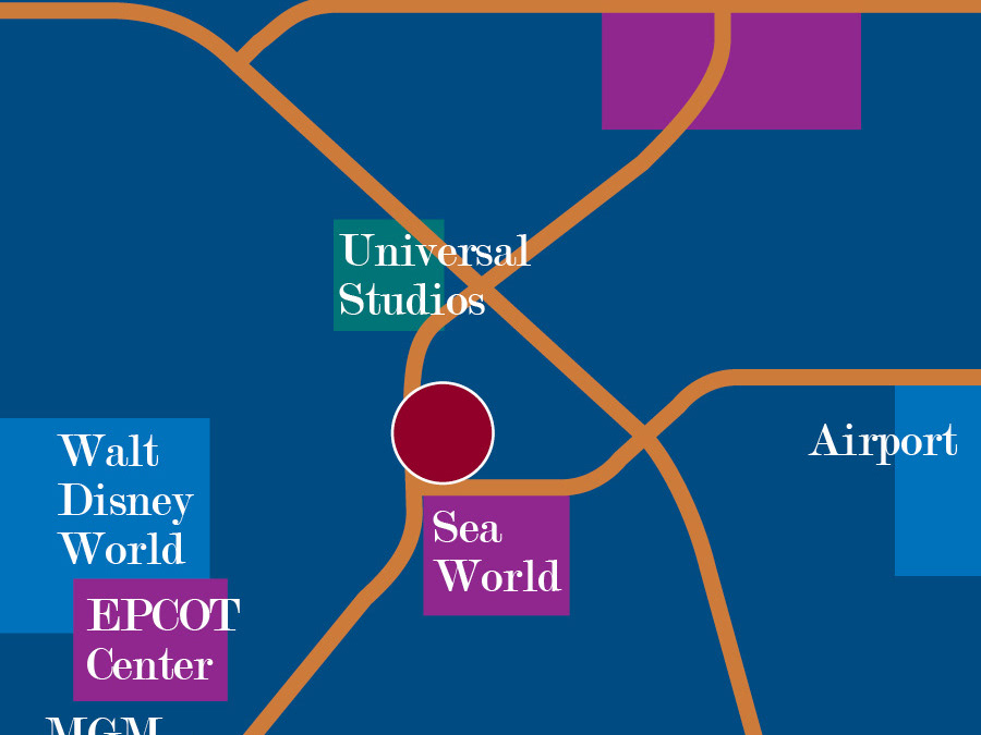
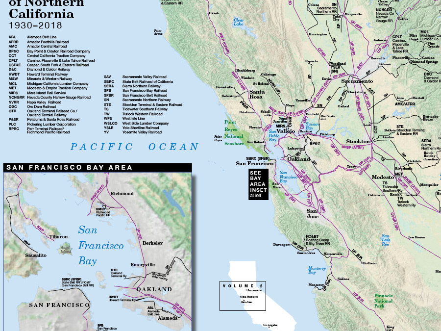
Some of our projects are graphics other than maps, but the design principle is the same: always think about what would make the information clear to the user or reader.
This diagram for an investment offering shows how the parts of a mixed-use project fit together.
We designed the historic markers installed to mark where distinguished Chicagoans lived or worked.
It was great fun illustrating 20th century popular music as a landscape of various streams and waypoints.
This (unpublished) timeline shows the national design context of the 1940s for the book Art Deco Chicago.

